Nextgen: Graphic Design Case Study
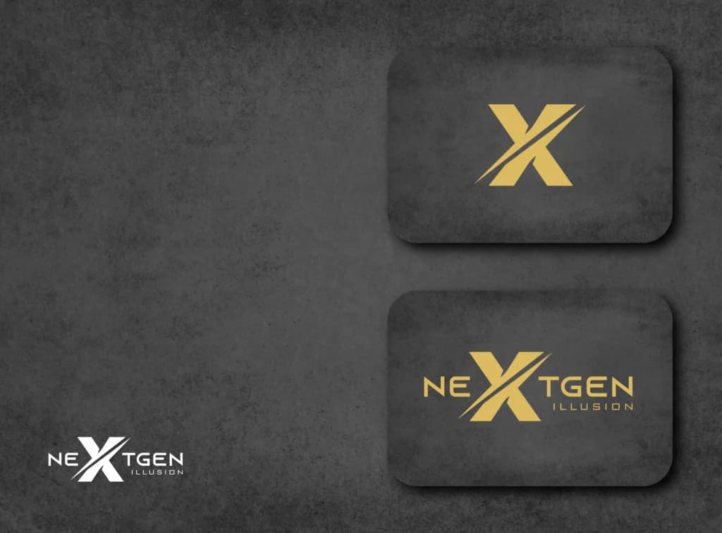
Nextgen Illusion needed a logo. The mark we designed is a bold X cut by a diagonal stroke, used on its own as an icon and inside the NEXTGEN wordmark, with ILLUSION set small beneath. The presentation shows it in gold on charcoal and reversed out in white.
The Challenge
The brand needed one mark that works two ways: as the full name where there is room, and as a small symbol on its own where there is not. Both versions also had to hold up in a single colour.
Our Approach
- •Built the mark around the X in the name, with a diagonal stroke cut through it.
- •Set the full lockup as NEXTGEN in capitals with the X enlarged, and ILLUSION in small, widely spaced capitals under the right-hand letters.
- •Prepared an icon-only version for small uses, and presented both versions in gold on a charcoal texture and reversed out in white.
The Results
- ✓The presentation shows the icon, the full lockup and the white version. Other brand items for Nextgen are not shown in our portfolio files.
- ✓No figures on brand recognition or sales are on record, so this page makes no claim about results.
Client benefits
- An icon version for places where the full name will not fit.
- A full lockup for places with room for the name.
- Gold and white versions for use on dark backgrounds.
Our role: Graphic Design
Get the full project details
Fill in the form and confirm your email address, and we'll send you the Nextgen project overview.
We respect your privacy. We don't share your data.
Features & Deliverables
Project Details
Project Information
Key details about this project.
- Business Name
- Nextgen
- Category
- Graphic Designing
- Status
- Completed
- Service
- Logo & Branding
Planning a similar project? See our Logo Design & Branding service.
Related Projects
Supacore
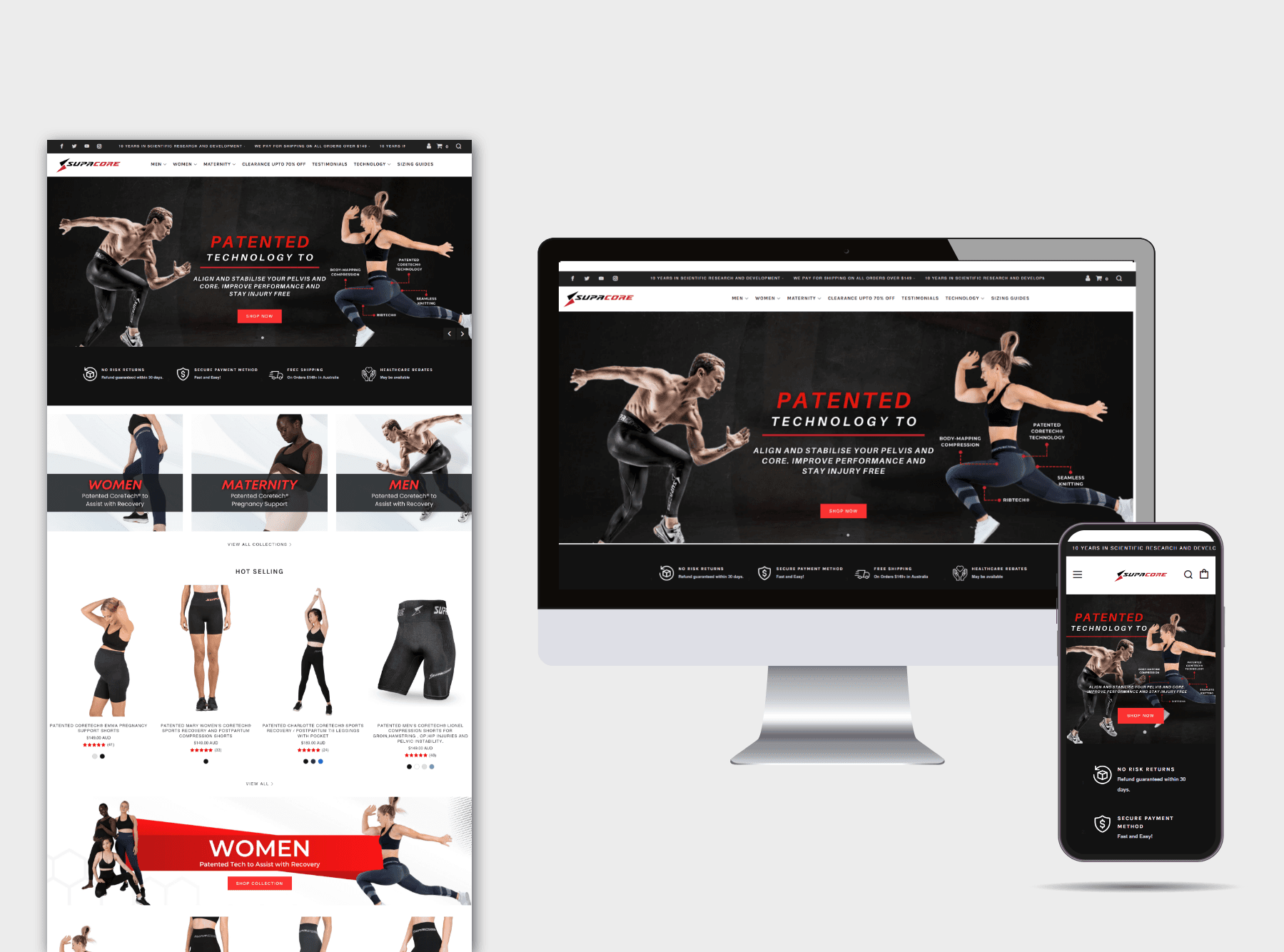
Supacore sells patented CORETECH compression garments for athletes, people with POTS and pregnant and postpartum mothers. We designed its Shopify store, organised so shoppers can find a garment by injury, activity or stage of pregnancy.
Noodz Bootique
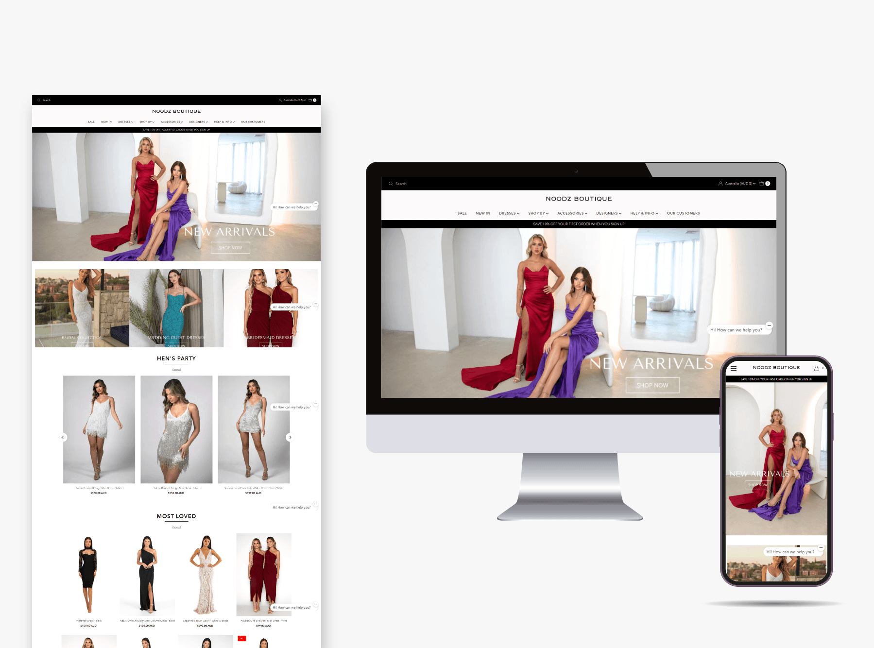
Shopify store for Noodz Boutique, a dress retailer, with the homepage sorted by occasion: bridal, bridesmaid, wedding guest and hen's party.
Lux And Co Australia
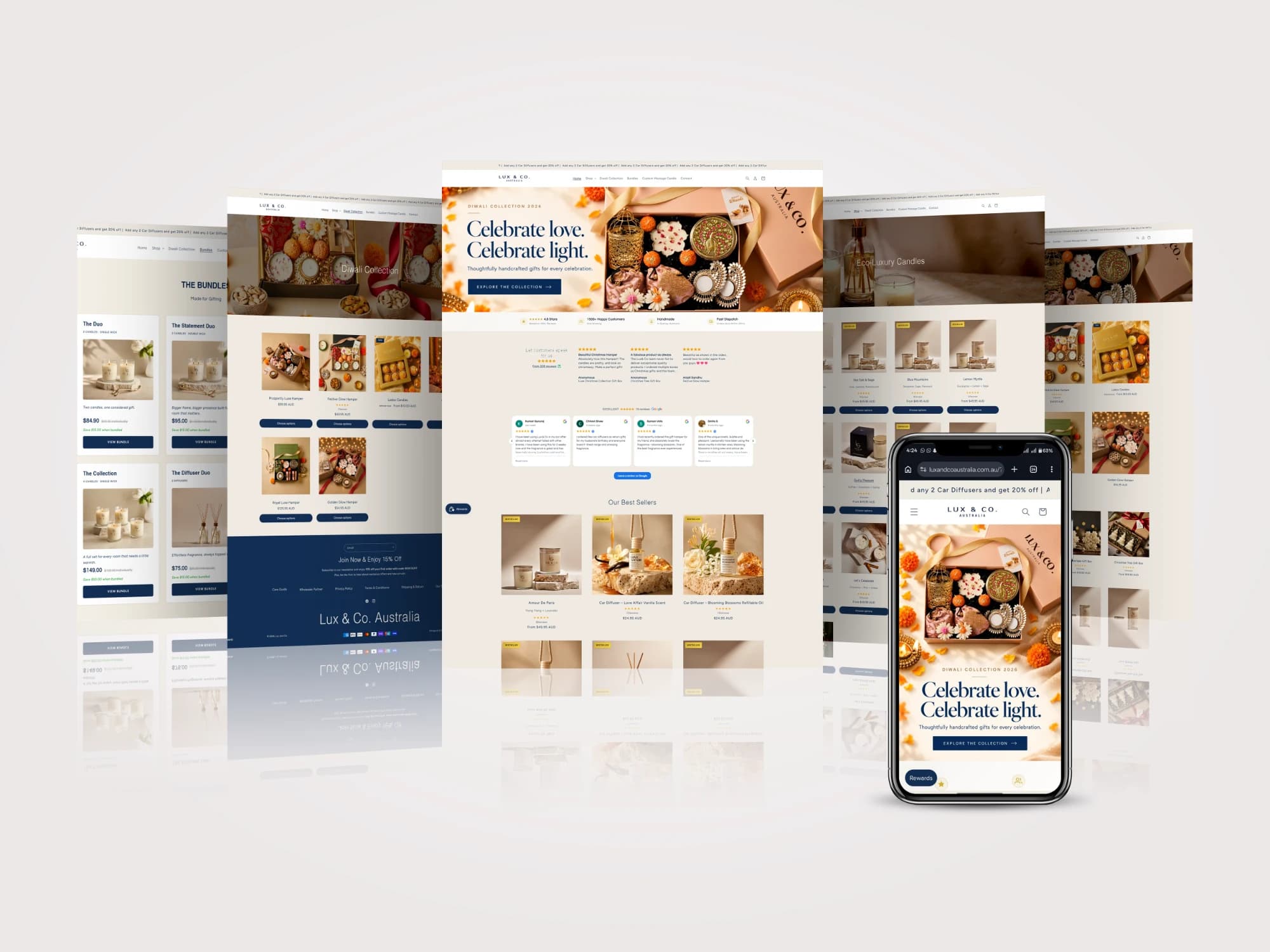
Lux & Co Australia makes candles and diffusers in Sydney. With the brand since its logo in 2022, we now run its store, marketing, email and design.